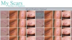
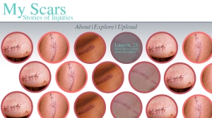
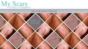
After finishing my first sketch, I took some time to sit down and create that sketch in photoshop, with actual pictures. What I quickly realised was that I didnt’ care for the design very much. I moved the title of the project to the left, to compliment how we read pages, but it did little to better my design. I felt that the design was a bit too flat and static.

I decided to play around with the images a bit. I want to have a design that seems fluid and soft. I want it to feel more like a landscape than a list. I personally like the one with the tilted squares the most. I feel like the circles ends up leaving the page a bit too empty. If the project were to be selected, I would work with someone on the group with design experience to continue developing these ideas, as my design skills are limited. One thing to note with all of these designs is that there are only four scar pictures which are recycled through the site, which makes it look a very repetitive and a bit confusing. When the site is finished the pictures will be like snowflakes, no two identical.


I will now go through some of the specific elements of the homepage. Note that this project is all centred around one page. The homepage will always be in the background of whatever is going on on the site.
The pictures would slightly enlarge as the curser moved over them, and when clicked they would enlarge to their full size as the rest of the site is dimmed (made darker in the background). When this is done one of two things would happen, either an audio recording would start or the story would appear under the picture in text. This would be the story of how they got the scar. Under the picture I would place buttons for sharing the story on social media, as well as having a button saying something like: “Upload Your Own Story/Scar”.
‘Explore’ is the main homepage, where you can explore the pictures.
‘About’ would feature a short written description of the project. Why and how was it created, as well as explaining how it can be used. This text would appear in front of the homepage in the same way the enlarged pictures do with the homepage being made darker in the background. The text would appear inside a box. This box would also have buttons for sharing the site with your friends on social media.
‘Upload’ is where the audience can go to upload their own scars and stories. The upload box would appear on top of the homepage. It would have a description of how to upload your picture. After the image is successfully uploaded you will be asked to adjust the thumbnail. And once that is done, it would let you record audio with your computers microphone right there on the site or write in your story.